

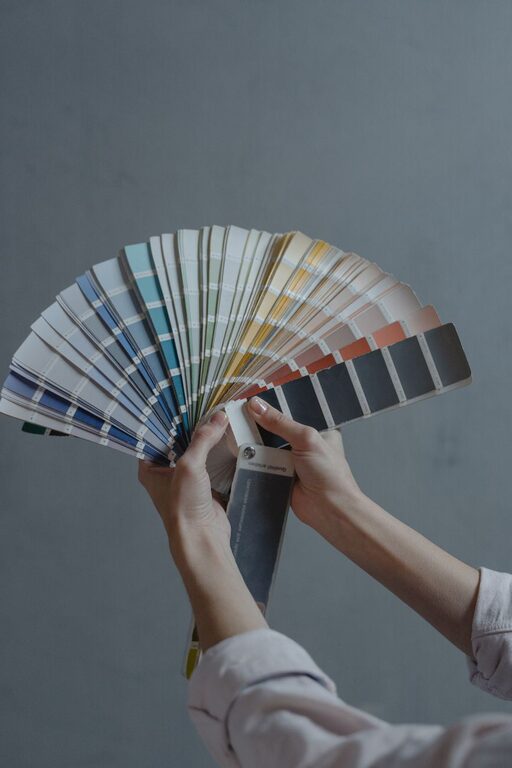
Creating a peaceful and calming atmosphere in your home begins with the colors you choose. Colors have a powerful effect on our mood and emotions, and selecting the right shades can help you feel more relaxed and comfortable in your living space. If you’re aiming to create a soothing environment, calm colors are the perfect choice.
In this post, we’ll share practical tips for choosing calm colors for your home, helping you design a space where you can unwind and feel at ease.
Understanding Calm Colors
Before diving into tips, it’s helpful to know what makes a color “calm.” Calm colors are usually soft, muted, and subtle shades that don’t overwhelm the senses. They often include:
– Pastel Tones: Soft versions of colors like blue, green, pink, and lavender.
– Neutrals: Shades of beige, taupe, ivory, and soft gray.
– Cool Colors: Light blues, greens, and gentle purples tend to have a calming effect.
– Muted Earth Tones: Gentle browns, warm grays, and soft olive greens.
These colors often help reduce stress and create a sense of balance.
Tips for Choosing Calm Colors
1. Consider the Mood You Want to Create
Think about how you want to feel in the room. Do you want the space to feel restful and tranquil, or softly inviting and cozy? Calm colors support both moods but choosing the right shade will refine the effect.
– For ultimate relaxation, light blues and soft greens mimic nature and water.
– For warmth and coziness, muted earth tones or creamy neutrals work well.
2. Test Colors in Different Lighting
Colors can look very different depending on natural and artificial light. Always test paint samples on your walls in various lighting conditions:
– Morning sunlight
– Afternoon light
– Evening with lamps or overhead lighting
This helps you see how the color changes throughout the day and ensures it maintains its calming quality.
3. Use a Simple Color Palette
Avoid using too many colors in a room. Sticking to a simple palette with two or three calm colors prevents the space from feeling busy or chaotic.
– Choose one main color for walls.
– Add one or two complementary colors for accents like pillows, rugs, or curtains.
– Keep patterns subtle and minimal to maintain the peaceful vibe.
4. Balance with Neutrals
Neutrals are natural partners for calm colors and help balance the room. They provide a blank canvas that complements soft hues and keeps the atmosphere light and airy.
– Off-white or warm beige walls create a cozy background.
– Soft gray or taupe accents add depth without overpowering the calm shades.
5. Think About Texture and Finish
The finish of your paint and textures in the room can influence how colors feel.
– Matte or eggshell finishes are best for calm colors because they reduce glare and soften the look.
– Incorporate natural textures like wood, linen, or cotton to add warmth and comfort.
6. Consider Your Existing Furniture and Decor
Choose colors that harmonize with your furniture and decorative pieces. Calm colors work best when they complement rather than clash with your current style.
– Wooden furniture pairs beautifully with soft greens, warm neutrals, and pale blues.
– Metallic or glass accents shine when surrounded by muted and gentle tones.
7. Use Color Psychology for Inspiration
Color psychology can guide your choices based on how colors influence mood:
– Blue: Known for its calming and soothing effects; ideal for bedrooms and bathrooms.
– Green: Symbolizes nature and renewal; perfect for living rooms and offices.
– Lavender: Soft purple tones promote relaxation; great in bedrooms or meditation spaces.
– Soft Pink: Adds warmth and comfort without being overly stimulating.
8. Create a Color Flow Throughout Your Home
For a cohesive and calm environment, ensure that the color palette flows smoothly from room to room. This doesn’t mean every room needs the exact same color but rather harmonizing tones that create a sense of continuity.
– Use neutral shades in hallways or connecting spaces.
– Transition from a cool blue bedroom to a warm beige living room with similar undertones.
Examples of Calm Color Pairings
Here are some easy-to-emulate combinations for a soothing home environment:
– Soft Blue and White: Classic and airy, perfect for coastal or minimalist styles.
– Muted Sage Green and Taupe: Brings nature inside with a warm, earthy feel.
– Lavender and Pale Gray: Elegant and serene, working well in bedrooms.
– Blush Pink and Cream: Gentle and uplifting for cozy living spaces.
Final Thoughts
Choosing calm colors for your home is one of the simplest ways to create a relaxing sanctuary. Remember to keep it subtle, test your colors in different lights, and pair them with textures and neutrals for the best results. With the right palette, your home can become a peaceful retreat that supports your well-being every day.
Start small by painting an accent wall or adding soft-colored textiles, and let your calm color journey unfold naturally!
—
We hope these tips help you pick the perfect calm colors for your home. Happy decorating!